Mapping Inequality Using the Neighborhood Change Database
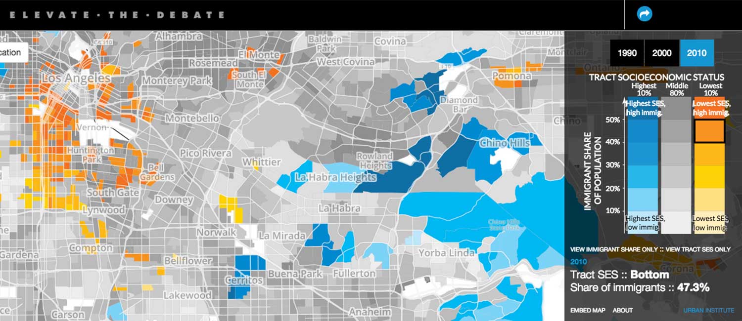
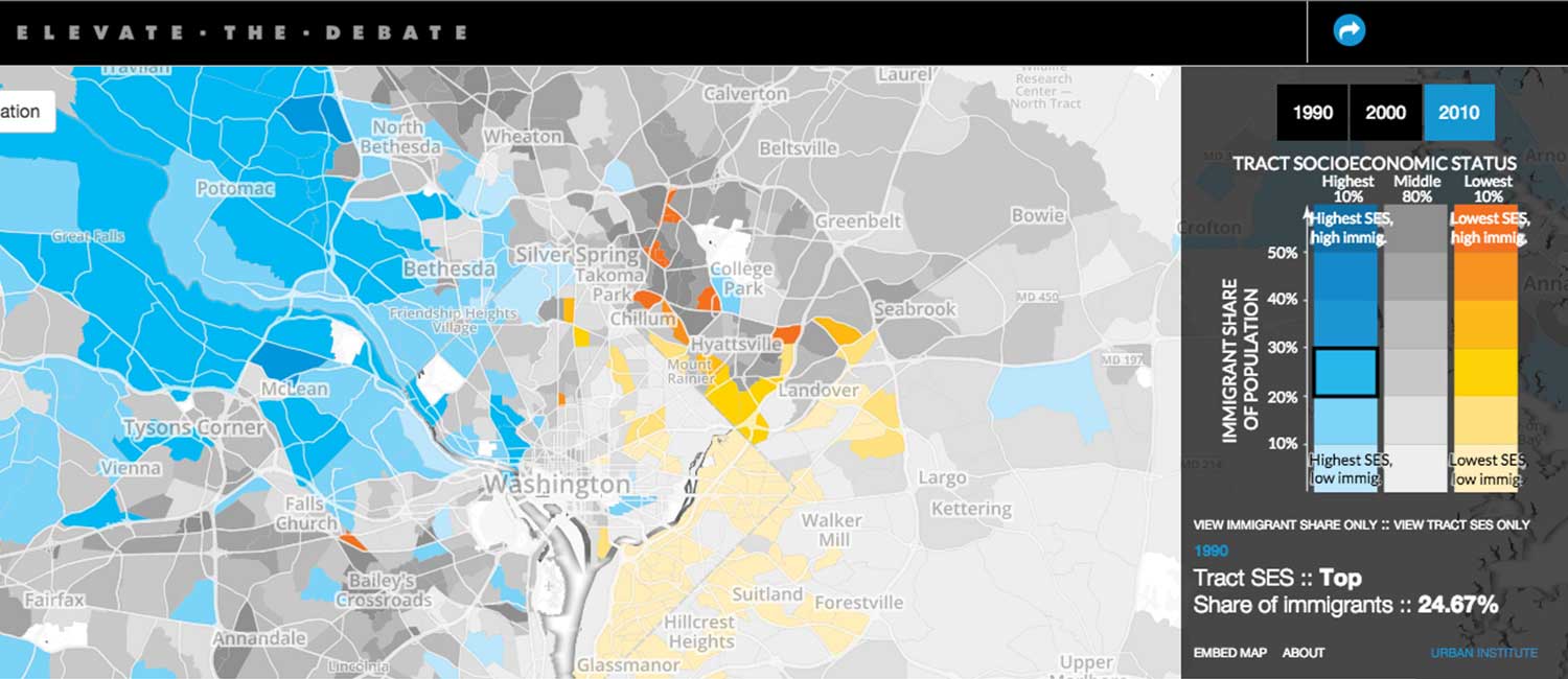
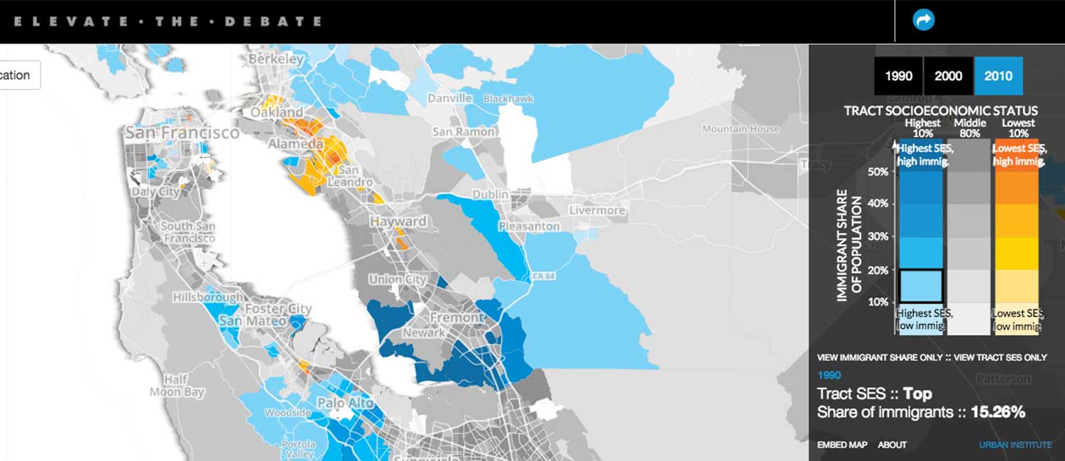
Urban Institute's "Neighborhood Change Database" normalizes geographies across time, allowing researchers to evaluate how they have changed. This specific series of projects examined how changes in socioeconomic status, immigration, and housing burdens have shifted at the neighborhood level since 1990.
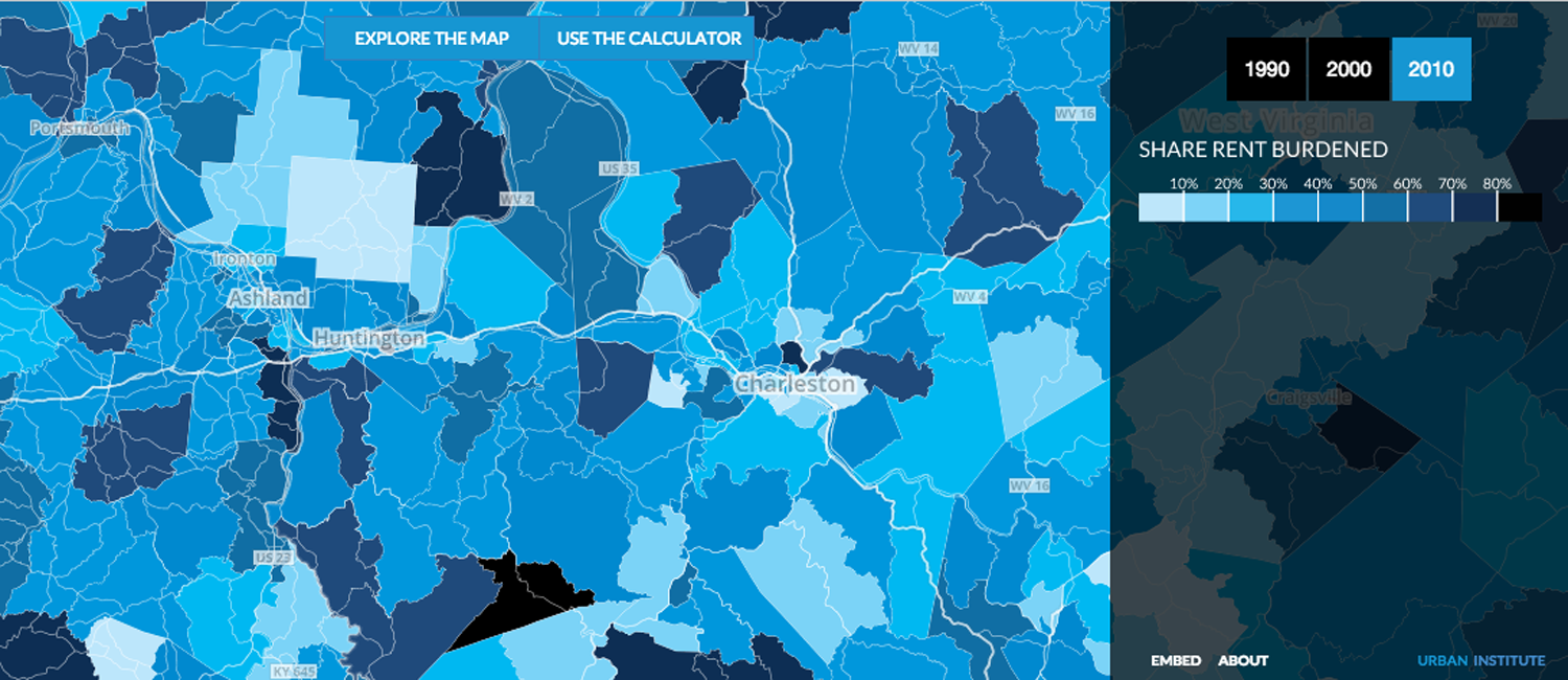
It was my job to translate these dense and multidimensional datasets into a visual story. The data were so complex that, for the immigration piece, I created a two-dimensional key: one for socioeconomic status of a neighborhood and dimension for the share of immigrants. The point of the map was to show the extremes, so the middle 80 percent of the country should fade into the background. For a user to navigate such a complex map, I developed an interactive key that changed as a user moved their cursor over the map.
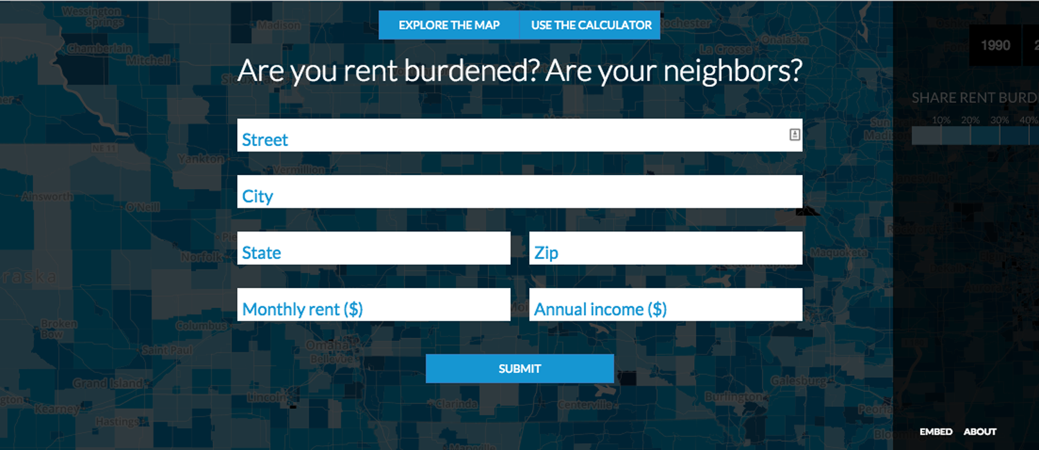
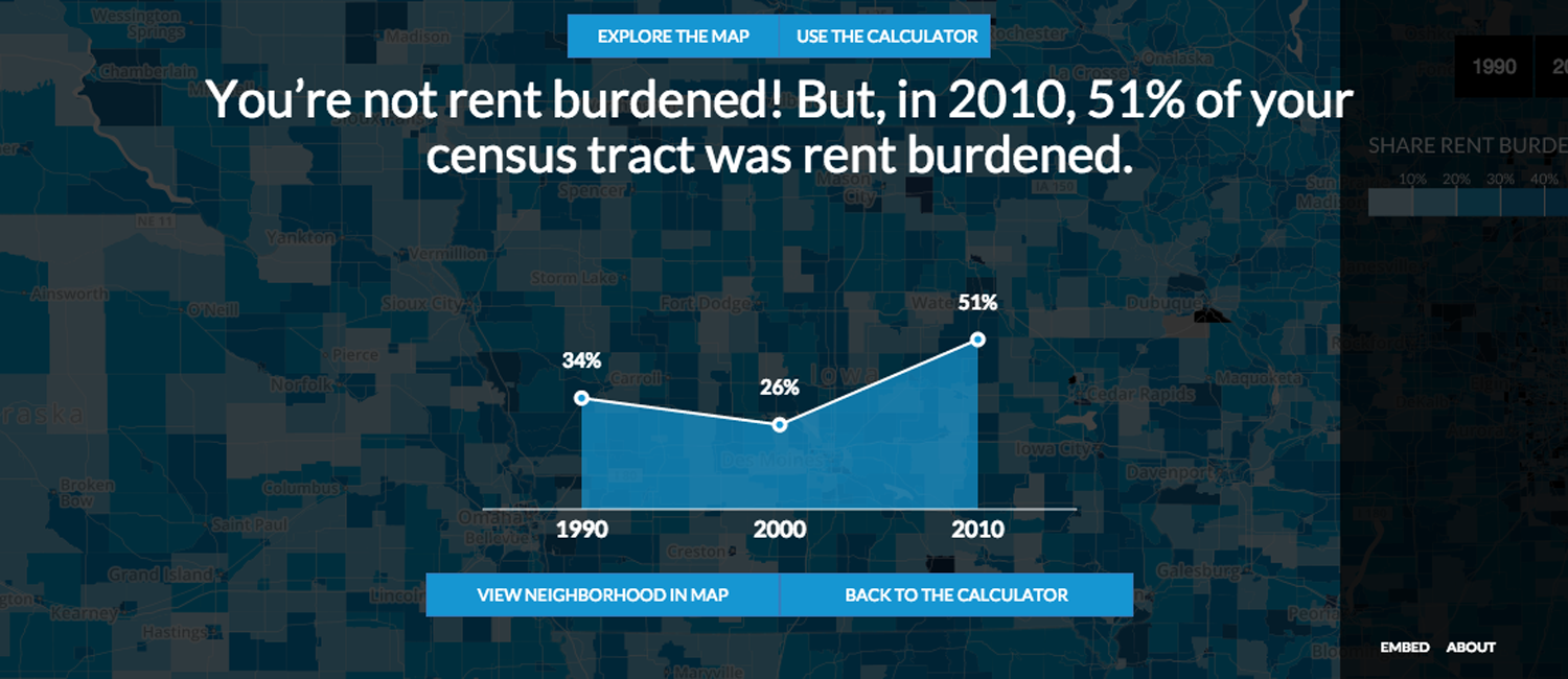
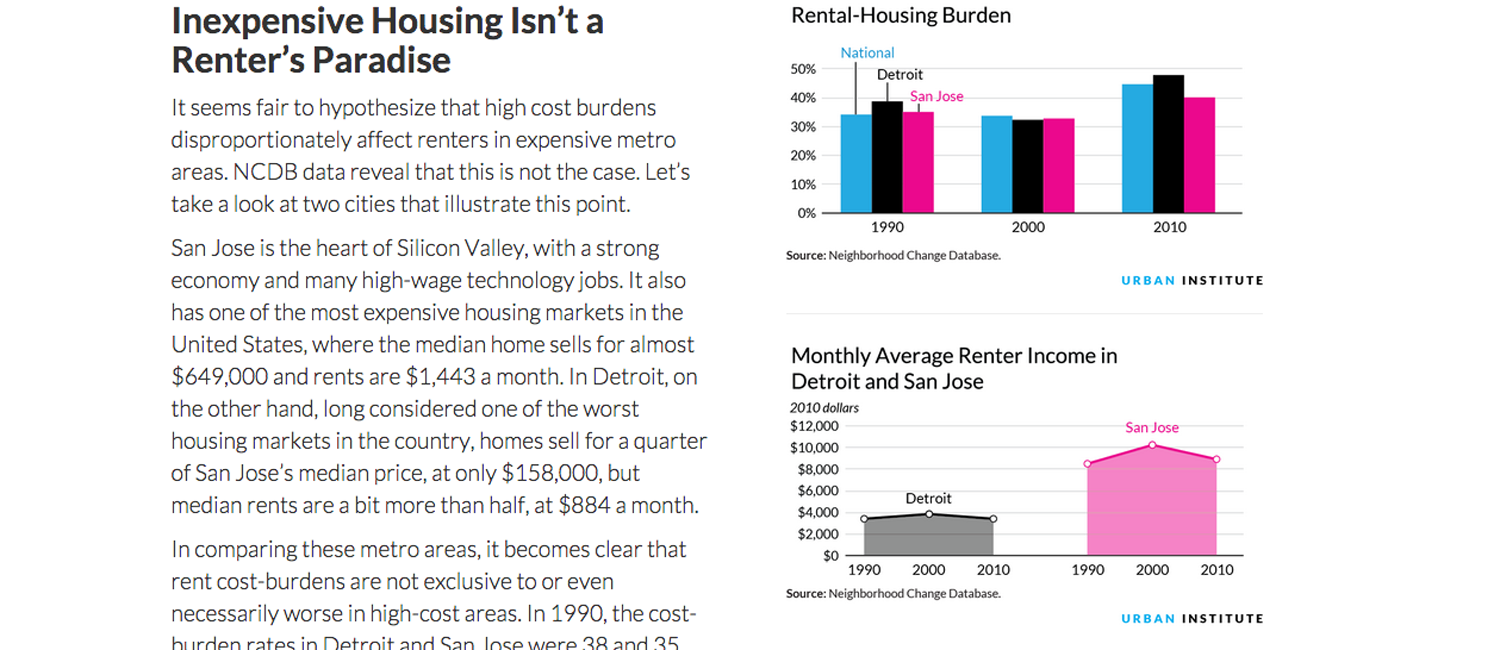
The maps were also paired with graphics and a calculator to complete the story.